Home of Iceland cuisine
Client: Njord
Project stages:
Research and audience analysis
The restaurant and festival's primary audience consists of tourists, nature lovers, and music festival enthusiasts. It was crucial to understand what draws people to such unique locations and what design elements would create the right atmosphere, highlighting the mystique and wild beauty of Iceland.
Tourism behavior analysis: Studying how tourists discover such unique locations and what is important to them when booking and visiting these places.
Festival-goers' needs analysis: Identifying which aspects of the festival (music lineup, venue, atmosphere) are key in attracting an audience.
Structure and information architecture development
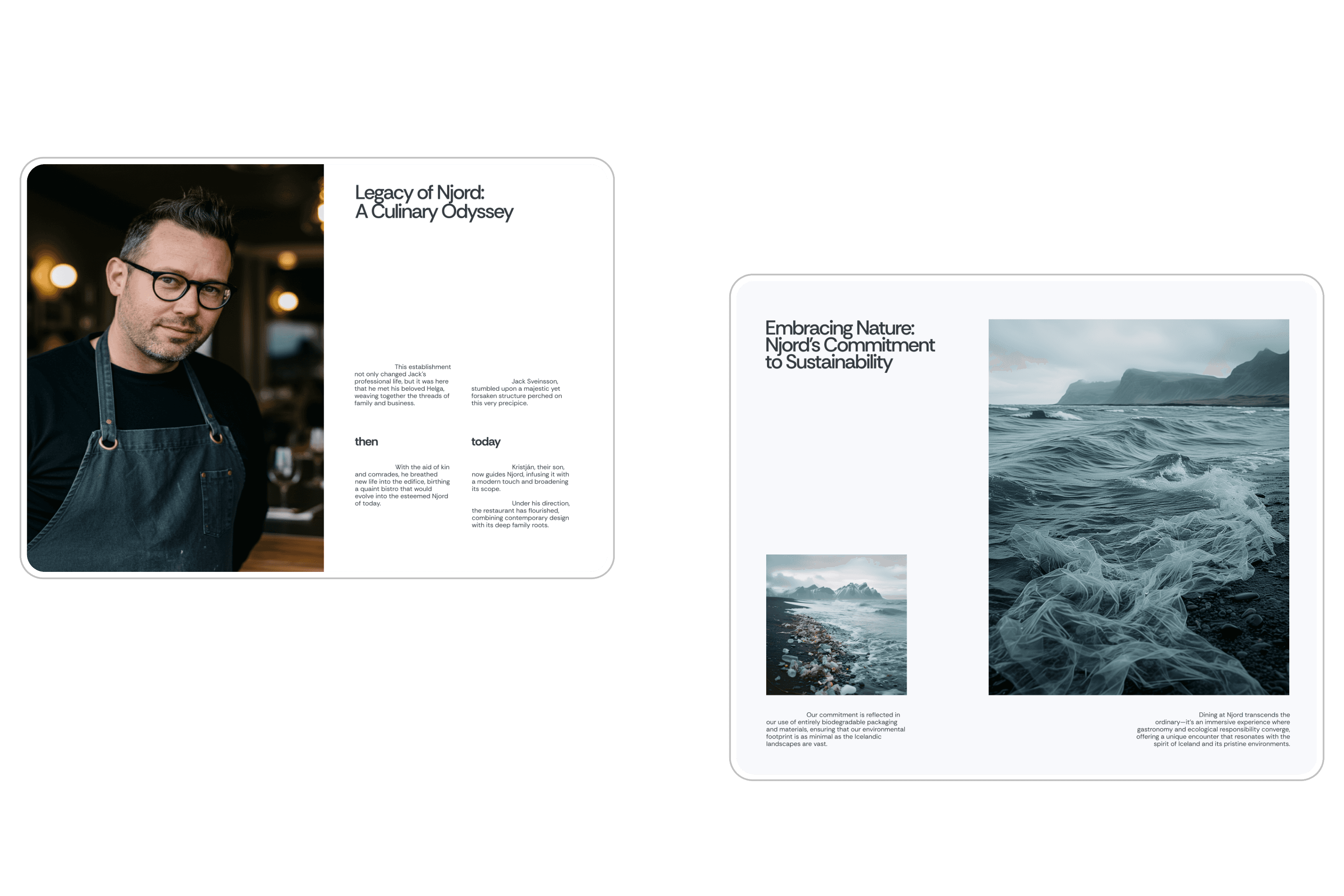
It was important to split the site into two main sections: the restaurant and the festival, while maintaining visual and stylistic cohesion. Each part of the site needed to be intuitive and immersive, reflecting the wild nature of Iceland.
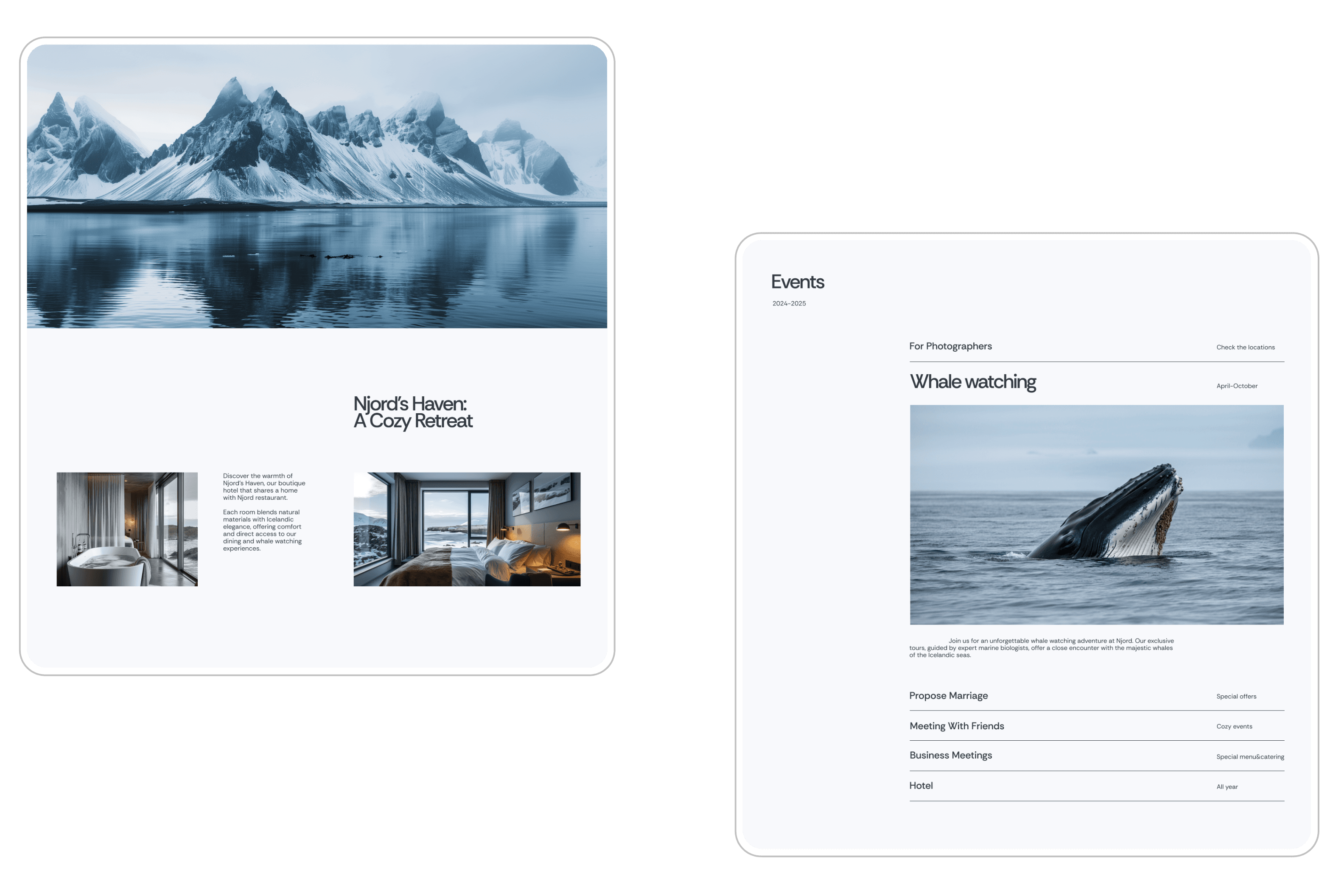
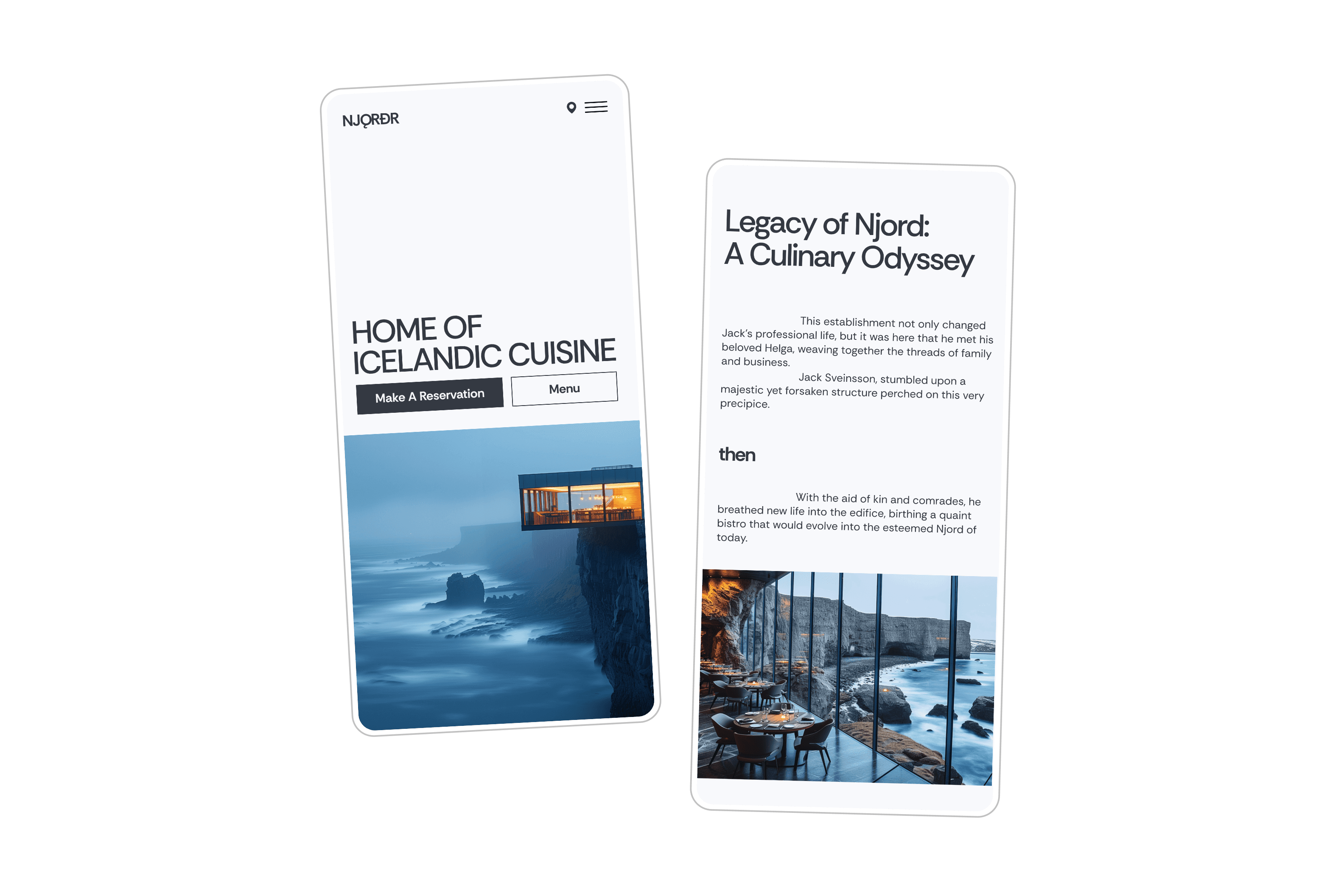
Homepage: A striking video background showcasing the cliff, ocean, and restaurant at sunset. Short descriptions of the restaurant and the festival, with options to immediately book a table or buy tickets.
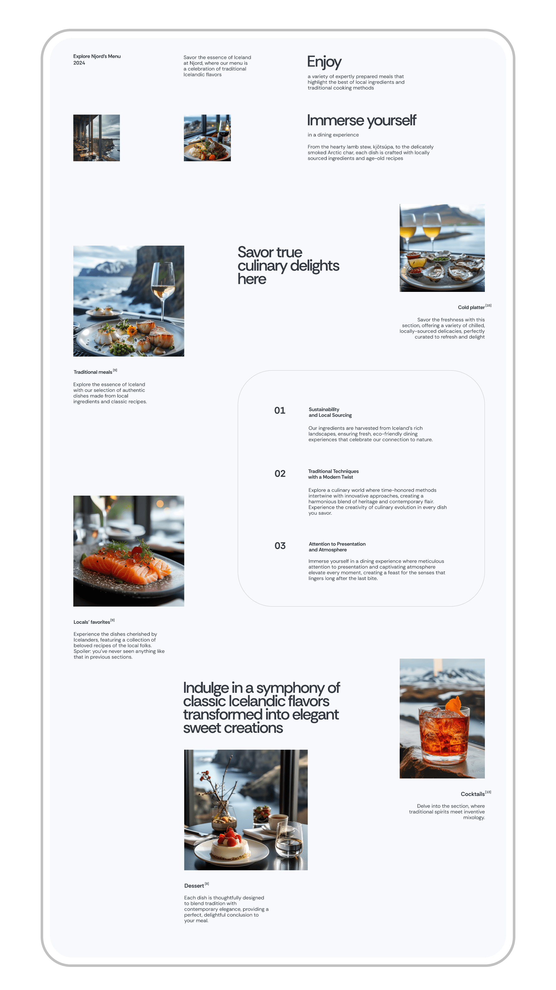
Restaurant section: This section showcases the restaurant’s dishes and concept, with a focus on seasonal and local ingredients. A simple table booking system is also easily accessible.
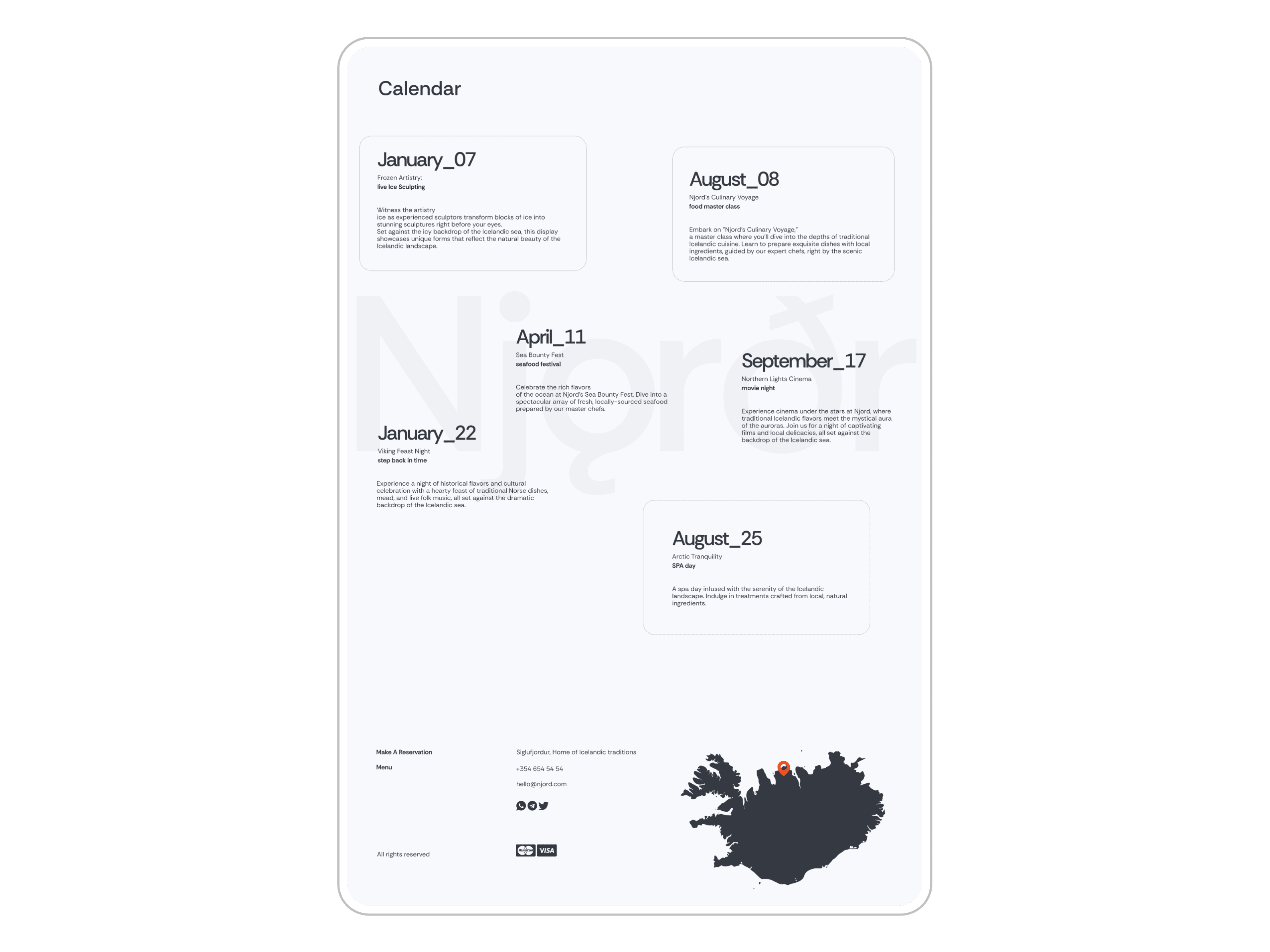
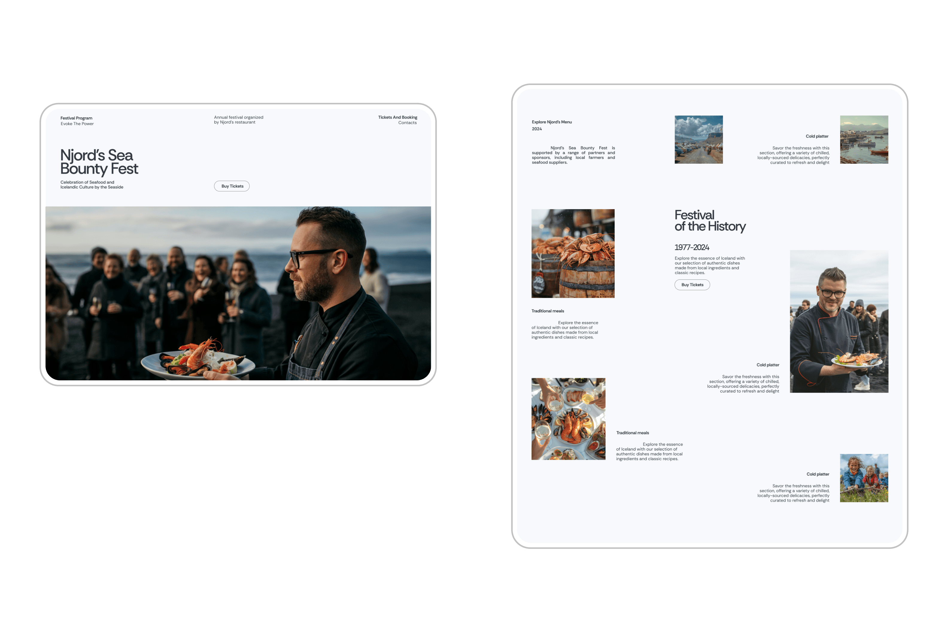
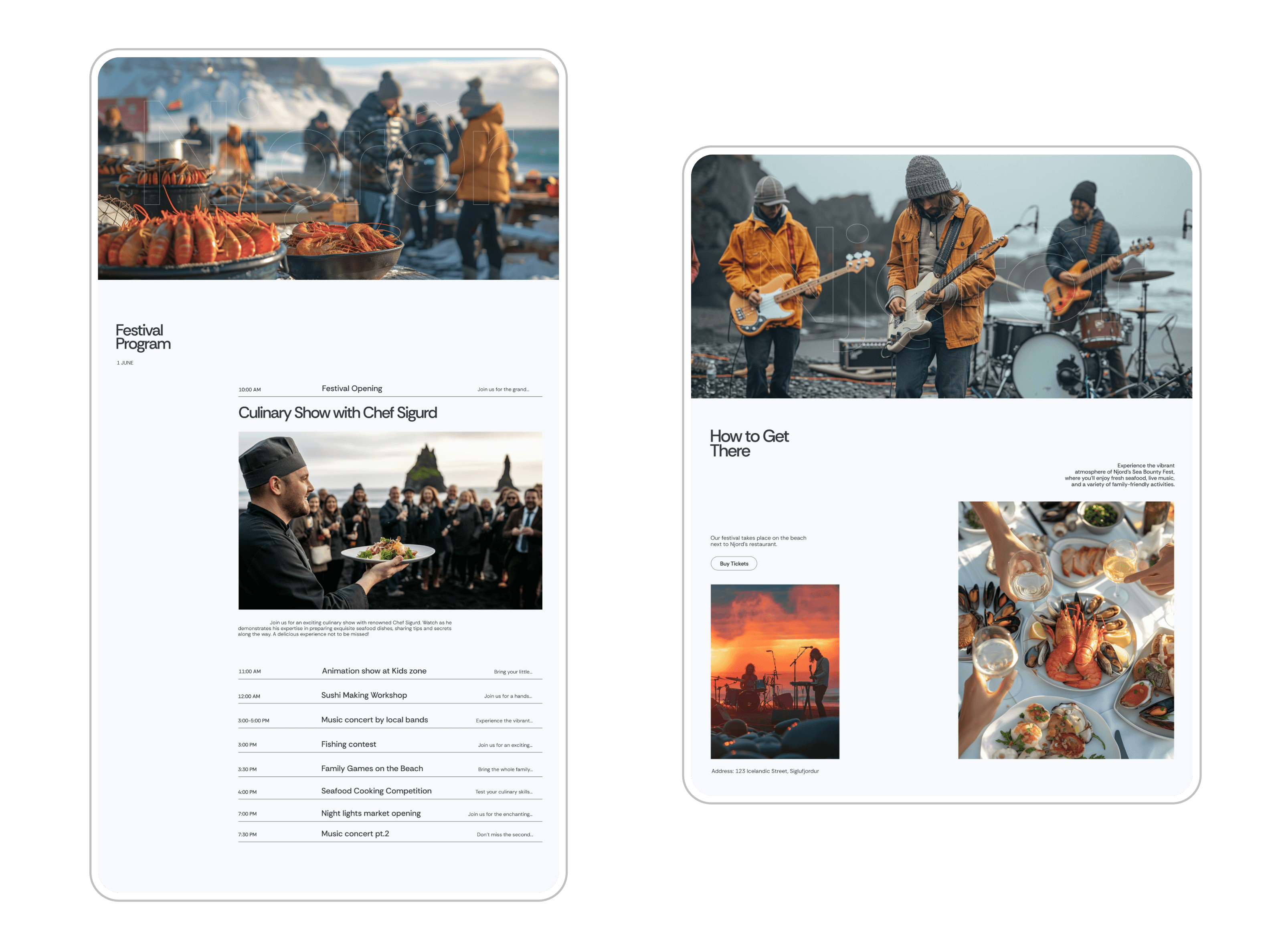
Festival section: The festival section features a performance schedule, artist information, as well as options to buy tickets and reserve accommodation.
UI/UX design
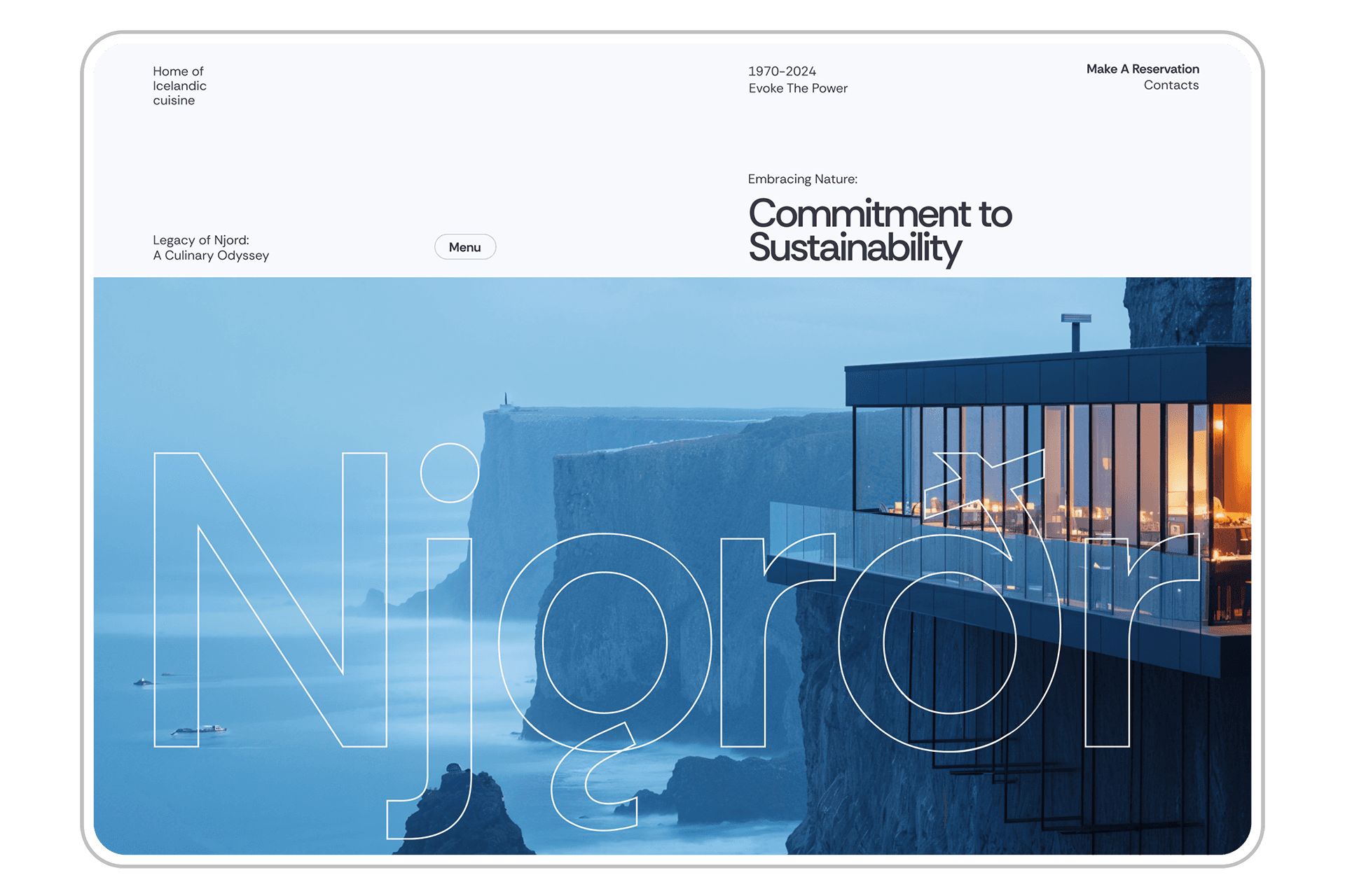
The main focus was on creating a sense of presence. The website design had to immerse the user in the atmosphere of Iceland’s rugged cliffs, evoking a feeling of remoteness and uniqueness.
Color palette: These colors embody Iceland's natural essence, allowing users to swiftly immerse themselves in the restaurant's ambiance. The Swiss design style, known for its spaciousness, was an inspiration that aligns perfectly with the restaurant's concept.
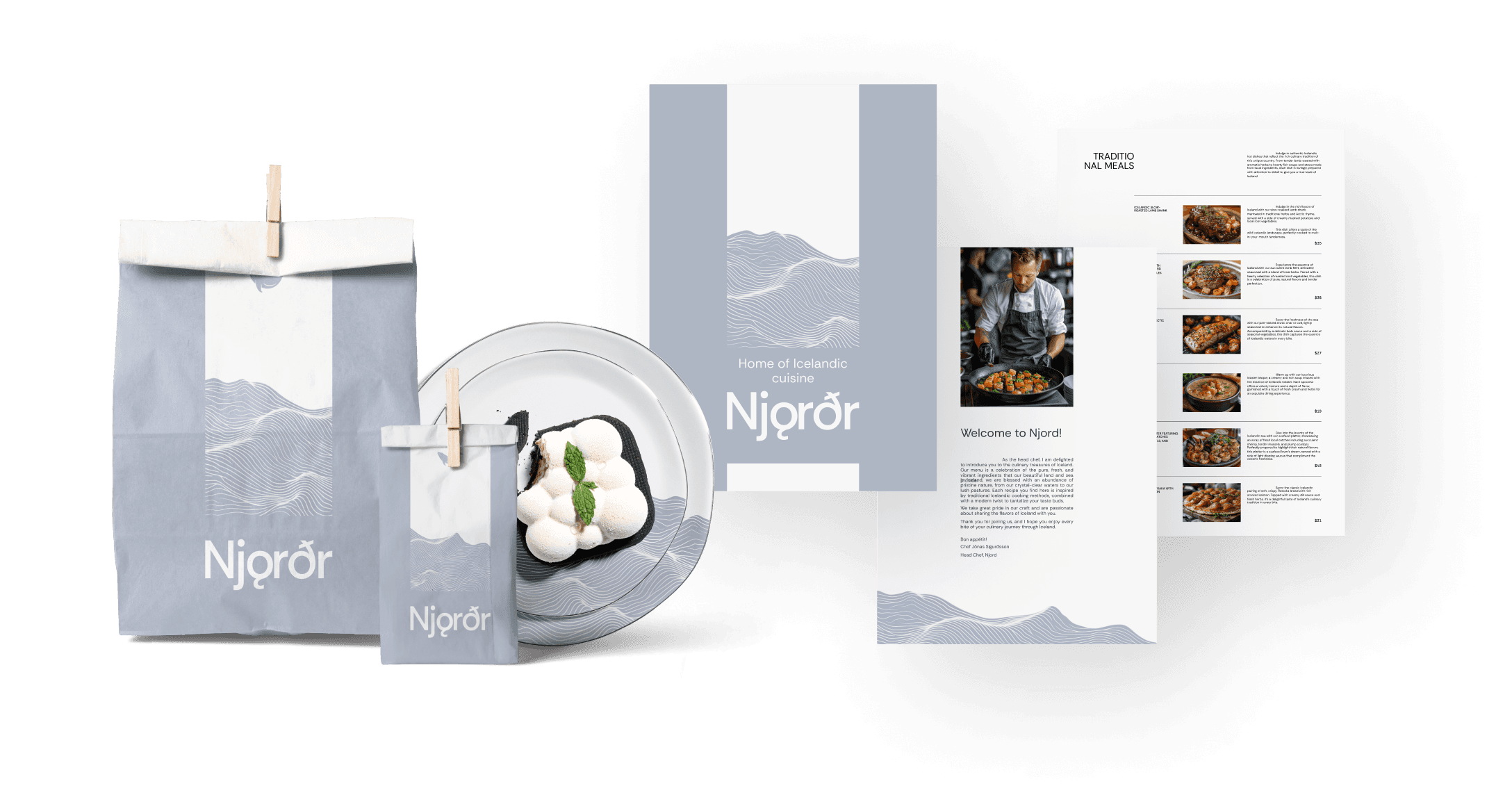
White signifies both air and pristine snow. Deep blue represents the sea, a vital food source for Icelanders throughout history, a tradition continued at Njord with fresh seafood offerings for guests.
Typography: The Rethink Sans font is a modern sans-serif typeface. Rethink Sans is characterized by a minimalist design, easy readability, and an unobtrusive nature that does not distract from the main content. It features clear and geometrically precise forms, giving it a neat appearance. Rethink Sans looks good both on screen and in print materials.
Animations: Soft, unobtrusive transitions and effects like parallax scrolling create a sense of immersion in the natural landscape.
Images and videos: Large, atmospheric photos of cliffs, the ocean, the festival, and restaurant dishes.
Booking and ticket purchasing functionality
To enhance user convenience, an intuitive system for table booking and festival ticket purchasing was developed:
Table booking: A simple form allows users to select the date, time, and number of people. Booking confirmation is sent via email.
Festival ticket purchase: An interactive seating map for the festival venue allows users to choose their zone and ticket type, with payment options available directly on the site.
Accommodation integration: The ability to book nearby accommodations through partner services, such as hotels or
campgrounds.
Testing and improvements
Usability testing was conducted to ensure that the website runs smoothly on all devices, including mobile, and that the booking functionality is simple and intuitive.
Launch and monitoring
After successful testing, the site was launched, followed by user interaction monitoring to further enhance the interface and optimize booking and ticket sales.
Packaging
It encompasses the visual elements that represent a brand, ensuring consistency and recognition across various touchpoints. The graphic design replicates the waves that restaurant visitors enjoy while eating food prepared from locally sourced seafood. Minimalistic design also was a huge inspiration here.
